About Me

My photo
let's see...i am crazy. i am an obsessive fan of MUSE. i'm currently studying in a university. hmm.... i would just go on talking about my interests and stuff that i like, but you got the rest of this section for that so, that should be it (for now) about me!

Monday, April 27, 2009

references and ideas for my birthday card

here are some references that i plan to use for my birthday card design


these are chinese paper cutting designs of cranes, one of the animal symbols for longevity


these are also chinese paper cutting designs of '寿' which means longevity.

here's some more intersting facts about chinese birthdays, did you know that 'Fu Lu Shou' (traditional chinese : 福祿壽; simplified Chinese: 福禄寿) refers to the concept of Good Fortune (Fu), Prosperity (Lu), and Longevity (Shou). This Taoist concept is thought to date back to the Ming Dynasty, when the Fu Star, Lu Star and Shou Star were considered to be personified deities of these attributes respectively. The term is commonly used in Chinese culture to denote the three attributes of a good life and are usual icons seen during chinese birthday and anniversaries.

(For more info about 'Fu Lu Shou', go to http://en.wikipedia.org/wiki/Fu_Lu_Shou )


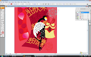
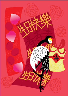
there you have it! my chinese birthday card design!!

my birthday card is finally done! as usual, here are the steps to making a chinese birthday card!


STEP 1:

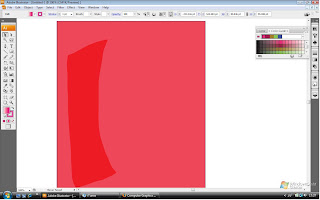
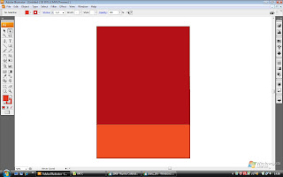
i drew the a rectangle as the background and had filled with a coral colour. then i drew another red rectangle. i used the pencil tool (P) for both rectangles


STEP 2:
i then drew a peach. i used the pencil tool (P) again for the outline and filled it in with a gradient fill of bright pink.


STEP 3:
next i used the elipse tool (L) to make the basic shape of an egg. i adjusted the anchors around it so it looks more oval, like an egg. i filled it with a dark megenta too.


STEP 4:
by using the Lasso tool (Q), i selected the peach and copied it. then i pasted the copy and positioned it around the red rectangle. some of the peaches are rotated using the Rotate tool (R). the same goes for the red eggs as well. then i drew another rectangle and filled it dark magenta. by using the Paintbrush tool (B), i wrote the words '生日快乐' on it.


STEP 5:
next i wrote '寿' using the same tool but with a different colour.


STEP 6:
i continued writing '生日快乐' and '寿' using the Paintbrush tool (B). i did not copy and pasted the words because the rectangle background is irregular, so each of the characters needs to be written individually to be fitted in nicely.


STEP 7:
next comes the crane. i drew the head and body using the Ellipse tool (L), the wings and feathers using the Paintbrush tool (B), and the Line segment tool (/) for the legs and the facial features and beak of the crane using the Pencil tool (P).


STEP 8:
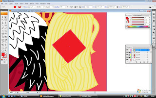
next to the crane, i drew another rectangle, this time it is light yellow. i drew on wavy lines to make it look like noodles. then i added a red diamond on it.


STEP 9:

then i used the Pencil tool to draw a ribbon next to it. and i used the Paintbursh tool (B) in 15 pt. oval to write '寿' , but in the Traditional chinese variation.


STEP 10:
after that, i used the Line segment tool (/) and Ellipse tool (L) to draw a pattern of a cherry blossom.


STEP 11:
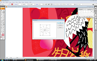
just like in STEP 4, i copy and pasted the cherry blosom design and positioned them around the rectangle. i used the Free distort effect to change the size of some of the cherry blossoms.


STEP 12:
i used the Ellipse tool (L) and and Pen tool (P) for another '寿' pattern for the background of the birthday card. i also used 'Reflect' for some lines in the design, since it is laterally inverted.


STEP 13:
then i copy and pasted the design again and positioned it around the background. i used 'Scale' to change the size of the designs around the background.


STEP 14:

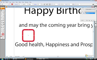
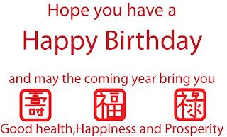
now we move on to the greetings part of the birthday card. i typed the greetings using the Type tool (T)


STEP 15:
then i used the Rounded rectangle tool to draw a rounded square on top the words 'good health', 'happiness' and ' prosperity'. i drew teh chinese characters for each of the words. '福' for happiness '禄' for prosperity and '寿' good health.


AND THERE YOU HAVE IT! MY CHINESE BIRTHDAY CARD DESIGN!

Tuesday, April 21, 2009

chinese birthday elements

since i am doing a card about chinese birthdays, let's talk about how us chinese, celebrate birthdays. every chinese has their own birth date on the Lunar Calendar, but unlike western birthdays, not many chinese celebrate them anymore, some dont even know their own Lunar birth date. only the birth of a newborn and the 60th birthday are celebrated occassions.

According to the customs, dyed-red eggs are eaten during Lunar birthdays because they are the symbol of changing process of life and their round shape is the symbol of harmonious and happy life. They are made red because red color is a sign of happiness in Chinese culture.

then, there are Longevity noodles which are a symbol of longevity in Chinese culture. They are as much a part of a Chinese birthday celebration as a birthday cake with lit candles is in many countries. Since noodles do symbolize long life, it is considered very unlucky to cut up a strand.

there are also peach buns which are also a symbol for longevity. the buns are only shaped like peaches, the inside filling is sweet which may be lotus or red bean paste.

The Crane is legendary in China for being the prince of all feathered creature on earth. The Crane is the ancient symbol for longevity because of its exceptionally long life span. that is why the crane is a common sight on chinese birthday invitations

here are also some common chinese greetings/characters you will see during birthdays:

生日快乐 (sheng ri kuai le)- happy birthday

寿 (shou) - longevity, commonly wished during chinese birthdays

birthday birthday card!

ah, time for the next assignment, the birthday card!!! everyone loves birthdays! but making a card isnt a piece of cake, pun intended!! haha!! well for our nest assignment, we are to design a birthday card based on our culture. obviously, it will be the chinese culture for me......

here is the template that i have chosen...

Friday, April 3, 2009

chinese new year, the celebration of spring

Here's my finished calendar!!!!!


TADA!!!!

'Chinese new year, the celebration of spring' is my statement for this calendar. in my calendar, i used the template for May from the given calendar templates from my lecturers. the structure of the template is something in the middle wile it is surrounded by a pattern of objects.

since i stated that Chinese new year is the celebration of spring, i used only things of nature and are related symbols for Chinese new year. i used peach blossoms, the symbol of luck and the arrival of spring for the Chinese. while the peach is a symbol for longevity. the '' which means spring, in the middle is inverted since the Chinese word 倒 (pinyin: dao), or "upside down", sounds similar as 到 (pinyin: dào), or "arrive". Therefore, it symbolizes the arrival of luck.

i drew it like a chinese paper cutting since '' is commonly seen as paper cuttings decorating walls or windows around the house during Chinese new year. the chinese normally use red paper for the paper cuttings so i used red as the colour as well. red is also an auspicious colour for the chinese. for the flowers and the peach, i used yellow-orange as the colour to make them look like gold paper cuttings. since gold means wealth, and during Chinese new year, everyone commonly greet each other '恭喜发财' (kong xi fa cai) which literally means "Congratulations and be prosperous".

Chinese new year is celebrated on the month of February in 2010, so the month of my calendar is February. (Not january, as shown in my steps)


the template for my calendar

steps to my chinese new year calendar

now let's look at the process of making my chinese new year calendar......


STEP 1:

i set my artboard to A3 size and coloured it dark red as the background for my calendar design and orange as the colour for the background for the calendar dates.


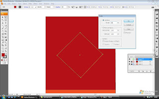
STEP 2:

i drew a diamond using the Line segment tool (\). this is the chinese decorative poster.


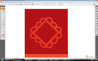
STEP 3:

i changed the thickness of the line to a 30 pt. stroke, creating a frame. i also added some ribbons around the edges to make the poster look fancy.


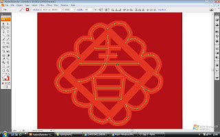
STEP 4:

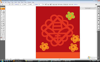
here's the '' now the poster looks like a chinese paper cutting. i drew it using the Line segment tool (\) and the pencil tool (P) with a thickness of 30pt.


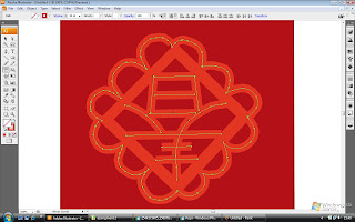
STEP 5:

i used the Magic wand tool (Y) to select all the lines. then i rotated it to make it inverted.


now it's inverted!


STEP 6:

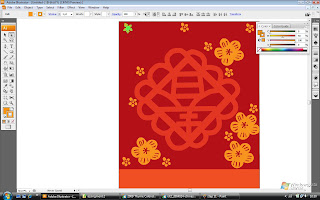
i drew a flower using the pencil tool (P) then i used the Lasso tool (L) to 'select' the whole flower and copied it. then i pasted it and arranged the copy around the calendar.


STEP 7:

the same goes for another type of flower. i drew it using the Pencil tool (P)and copy-pasted it using the Lasso tool (L) then positioned each copy around the calendar.


STEP 8:

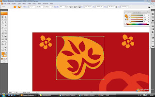
next i drew a peach and again i used the same method for the previous flowers.


STEP 9:

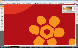
for this flower, i used the Polygon tool to draw out the center of the flower while i used the pencil tool (P) for the petals.


STEP 10:

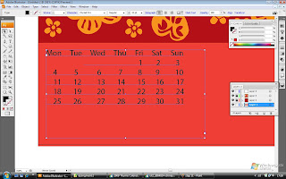
then for the calendar dates, i used the Type tool (T).


STEP 11:

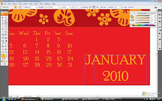
then i changed the colour of the numbers to suit the colour scheme of the calendar.


as a conclusion, most of my calendar is comprised of copy-pasted patterns!!!

plans for my calendar

ok so, i have finally planned out how my calendar looks like.....

instead of having the inverted '福' (fú) in the middle, it shall be '' but it will still be inverted.

surrounding it will be flowers or little charms of chinese new year. the calendar will have a 'chinese paper cut' look. i think the chinese paper cuts look interesting. chinese paper cutting is a unique artform and has existed for thousands of years. they are usually used as decorations on windows orand doors during chinese new year. the papers are usually red because red is also a lucky colour in the chinese cullture. here are the references i plan to use for my calendar.


Monday, March 30, 2009

the meaning of chinese new year

Chinese new year is the most important of the traditional Chinese holidays. It is also known as the Lunar New Year, especially by people in mainland China and Taiwan. The festival traditionally begins on the first day of the first month in the Chinese calendar and ends on the 15th day.

According to tales and legends, Chinese New Year came about from the fight against a mythical beast called the Nian or "Year" in Chinese. Nian would come on the first day of New Year to devour livestock, crops, and even villagers, especially children. To protect themselves, the villagers would put food in front of their doors at the beginning of every year. It was believed that after the Nian ate the food they prepared, it wouldn’t attack any more people. One time, people saw that the Nian was scared away by a little child wearing red. The villagers then understood that the Nian was afraid of the color red. Hence, every time when the New Year was about to come, the villagers would hang red lanterns and red spring scrolls on windows and doors. People also used firecrackers to frighten away the Nian. From then on, the Nian never came to the village again.

general idea of my calendar

The festival i am using for my calendar design is Chinese New Year. there are abundant of interesting aspects to Chinese New Year, so choosing a design for this calendar will be easier.

I'll be using the May template as the calendar design. the template has a layout of something in the centre patterns around it.

Obviously the colours used will revolve around shades of red and yellow because those are the lucky colours for Chinese New Year. out of the many aspects of Chinese New Year, i will use the the red diamond-shaped posters with the character '福' (fú), which means "auspiciousness" which are displayed around the house and on doors. This sign is usually seen hanging upside down, since the Chinese word 倒 (pinyin: dao), or "upside down", sounds similar as 到 (pinyin: dào), or "arrive". Therefore, it symbolizes the arrival of luck, happiness, and prosperity in the middle. while i'll use peach blossoms which symbolizes luck, as the patterns around the red poster.

The May template for my calendar

Friday, March 6, 2009

my final final logo

ok, after much evaluation, i have re-designed my re-designed logo!! here it is! the FINAL one!


i scrapped the idea of spelling out 'coffee' using the faces and the cup coz it didnt look obvious, so i typed in 'coffee' to the logo. the 2 straws dont resemble much of '力' so i decided to draw it inside the cup instead and i moved the 2 faces nearer to the cup to let it resemble more of '咖'. now it looks more clearer and much closer to my design concept, that is to use '咖' to represent the local chinese's love for coffee.

hopefully this logo works!! i shall further explain my logo in my presentation!

a logo in 10 steps

I have finally done my final work for my redesigned logo and i did it in 10 steps!! let's take a look!

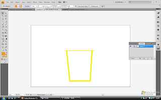
STEP 1:

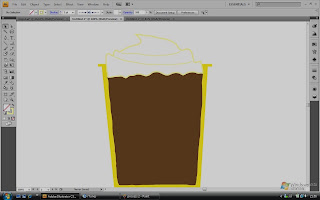
i drew a cup using the Line segment tool (/)


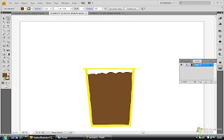
STEP 2:

i filled the cup with coffee by drawing using the Pencil tool (P). it has peaks and looks stiff because it's ice-blended!!


STEP 4:

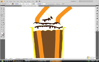
Well, i added cream peaks (still using the Pencil tool (P)) on top of the coffee as the famous Starbucks frappuccino would normally have. i reduced the brightness of the picture to let you see the cream, apparently i've chosen a colour that was too light to be seen, haha!


STEP 5:

I added chocolate syrup to the cream to make it look more 'obvious' and Starbucks also adds on the chocolate syrup to the cream too, another trademark! 2 straws were added too. (still using the Pencil tool (P) here)


STEP 6:

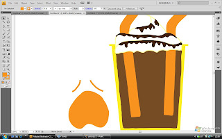
I drew a tired or whining face on the left. this is to resemble the ' 口 ' on the left. it also shows how 1 is before having a cup of Starbucks....


STEP 7:

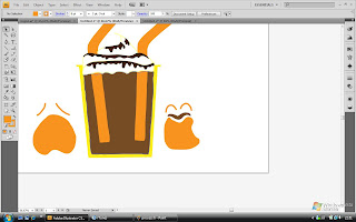
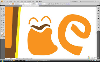
Next is a happy face, to resemble the ' 口 ' on the right and how 1 would be after a cup of Starbucks (hence the coffee moustache), which is happy! BOth faces were drawn using the Pencil tool also)


STEP 8:

The letters 'c' and 'e' were drawn next using the Pencil tool again.


STEP 9:

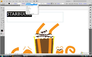
then i typed 'STARBUCKS' using the Type tool (T)


STEP 10:

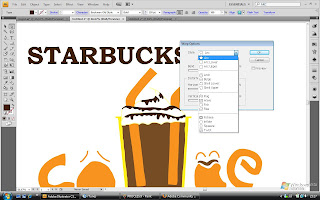
then i made the word arc by choosing the 'make envelope' option and i selected 'arc' as the style.


AND FINALLY..... AFTER 10 STEPS....


HERE'S MY RE-DESIGNED LOGO STARBUCKS!!! TADA!!!!