Chinese new year is the most important of the traditional Chinese holidays. It is also known as the Lunar New Year, especially by people in mainland China and Taiwan. The festival traditionally begins on the first day of the first month in the Chinese calendar and ends on the 15th day.
According to tales and legends, Chinese New Year came about from the fight against a mythical beast called the Nian or "Year" in Chinese. Nian would come on the first day of New Year to devour livestock, crops, and even villagers, especially children. To protect themselves, the villagers would put food in front of their doors at the beginning of every year. It was believed that after the Nian ate the food they prepared, it wouldn’t attack any more people. One time, people saw that the Nian was scared away by a little child wearing red. The villagers then understood that the Nian was afraid of the color red. Hence, every time when the New Year was about to come, the villagers would hang red lanterns and red spring scrolls on windows and doors. People also used firecrackers to frighten away the Nian. From then on, the Nian never came to the village again.
About Me

- Charlotte
- let's see...i am crazy. i am an obsessive fan of MUSE. i'm currently studying in a university. hmm.... i would just go on talking about my interests and stuff that i like, but you got the rest of this section for that so, that should be it (for now) about me!
Monday, March 30, 2009
general idea of my calendar
The festival i am using for my calendar design is Chinese New Year. there are abundant of interesting aspects to Chinese New Year, so choosing a design for this calendar will be easier.
I'll be using the May template as the calendar design. the template has a layout of something in the centre patterns around it.
Obviously the colours used will revolve around shades of red and yellow because those are the lucky colours for Chinese New Year. out of the many aspects of Chinese New Year, i will use the the red diamond-shaped posters with the character '福' (fú), which means "auspiciousness" which are displayed around the house and on doors. This sign is usually seen hanging upside down, since the Chinese word 倒 (pinyin: dao), or "upside down", sounds similar as 到 (pinyin: dào), or "arrive". Therefore, it symbolizes the arrival of luck, happiness, and prosperity in the middle. while i'll use peach blossoms which symbolizes luck, as the patterns around the red poster.

The May template for my calendar
Friday, March 6, 2009
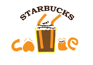
my final final logo
ok, after much evaluation, i have re-designed my re-designed logo!! here it is! the FINAL one!
.jpg)
i scrapped the idea of spelling out 'coffee' using the faces and the cup coz it didnt look obvious, so i typed in 'coffee' to the logo. the 2 straws dont resemble much of '力' so i decided to draw it inside the cup instead and i moved the 2 faces nearer to the cup to let it resemble more of '咖'. now it looks more clearer and much closer to my design concept, that is to use '咖' to represent the local chinese's love for coffee.
hopefully this logo works!! i shall further explain my logo in my presentation!
a logo in 10 steps
I have finally done my final work for my redesigned logo and i did it in 10 steps!! let's take a look!
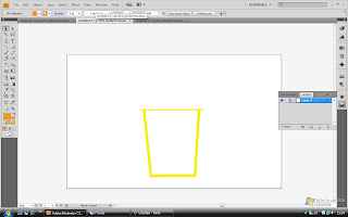 STEP 1:
i drew a cup using the Line segment tool (/)
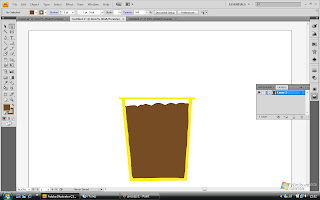 STEP 2:
i filled the cup with coffee by drawing using the Pencil tool (P). it has peaks and looks stiff because it's ice-blended!!
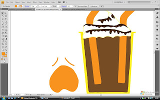
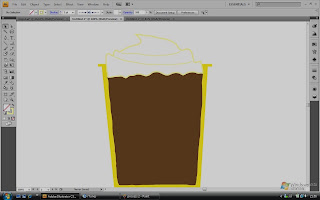 STEP 4:
Well, i added cream peaks (still using the Pencil tool (P)) on top of the coffee as the famous Starbucks frappuccino would normally have. i reduced the brightness of the picture to let you see the cream, apparently i've chosen a colour that was too light to be seen, haha!
 STEP 5:
I added chocolate syrup to the cream to make it look more 'obvious' and Starbucks also adds on the chocolate syrup to the cream too, another trademark! 2 straws were added too. (still using the Pencil tool (P) here)
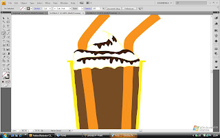
 STEP 6:
I drew a tired or whining face on the left. this is to resemble the ' 口 ' on the left. it also shows how 1 is before having a cup of Starbucks....
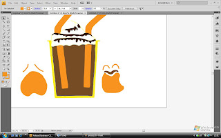 STEP 7:
Next is a happy face, to resemble the ' 口 ' on the right and how 1 would be after a cup of Starbucks (hence the coffee moustache), which is happy! BOth faces were drawn using the Pencil tool also)
 STEP 8:
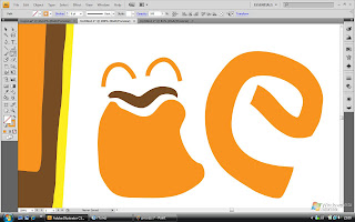
The letters 'c' and 'e' were drawn next using the Pencil tool again.
 STEP 9:
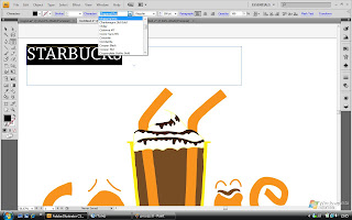
then i typed 'STARBUCKS' using the Type tool (T)
 STEP 10:
then i made the word arc by choosing the 'make envelope' option and i selected 'arc' as the style.
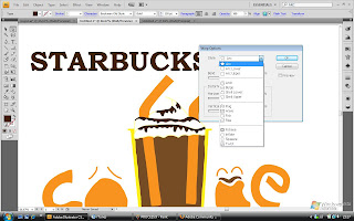
AND FINALLY..... AFTER 10 STEPS....
.jpg)
 STEP 1:
i drew a cup using the Line segment tool (/)
 STEP 2:
i filled the cup with coffee by drawing using the Pencil tool (P). it has peaks and looks stiff because it's ice-blended!!
 STEP 4:
Well, i added cream peaks (still using the Pencil tool (P)) on top of the coffee as the famous Starbucks frappuccino would normally have. i reduced the brightness of the picture to let you see the cream, apparently i've chosen a colour that was too light to be seen, haha!
 STEP 5:
I added chocolate syrup to the cream to make it look more 'obvious' and Starbucks also adds on the chocolate syrup to the cream too, another trademark! 2 straws were added too. (still using the Pencil tool (P) here)
 STEP 6:
I drew a tired or whining face on the left. this is to resemble the ' 口 ' on the left. it also shows how 1 is before having a cup of Starbucks....
 STEP 7:
Next is a happy face, to resemble the ' 口 ' on the right and how 1 would be after a cup of Starbucks (hence the coffee moustache), which is happy! BOth faces were drawn using the Pencil tool also)
 STEP 8:
The letters 'c' and 'e' were drawn next using the Pencil tool again.
 STEP 9:
then i typed 'STARBUCKS' using the Type tool (T)
 STEP 10:
then i made the word arc by choosing the 'make envelope' option and i selected 'arc' as the style.
AND FINALLY..... AFTER 10 STEPS....
.jpg)
HERE'S MY RE-DESIGNED LOGO STARBUCKS!!! TADA!!!!
Subscribe to:
Posts (Atom)