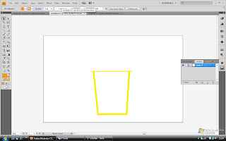
 STEP 1:
i drew a cup using the Line segment tool (/)
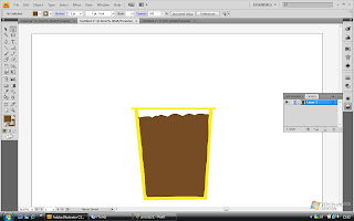 STEP 2:
i filled the cup with coffee by drawing using the Pencil tool (P). it has peaks and looks stiff because it's ice-blended!!
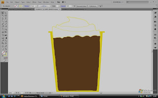 STEP 4:
Well, i added cream peaks (still using the Pencil tool (P)) on top of the coffee as the famous Starbucks frappuccino would normally have. i reduced the brightness of the picture to let you see the cream, apparently i've chosen a colour that was too light to be seen, haha!
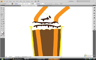 STEP 5:
I added chocolate syrup to the cream to make it look more 'obvious' and Starbucks also adds on the chocolate syrup to the cream too, another trademark! 2 straws were added too. (still using the Pencil tool (P) here)
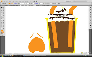 STEP 6:
I drew a tired or whining face on the left. this is to resemble the ' 口 ' on the left. it also shows how 1 is before having a cup of Starbucks....
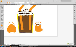 STEP 7:
Next is a happy face, to resemble the ' 口 ' on the right and how 1 would be after a cup of Starbucks (hence the coffee moustache), which is happy! BOth faces were drawn using the Pencil tool also)
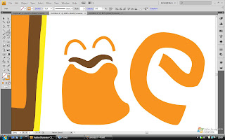 STEP 8:
The letters 'c' and 'e' were drawn next using the Pencil tool again.
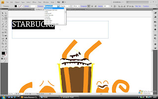 STEP 9:
then i typed 'STARBUCKS' using the Type tool (T)
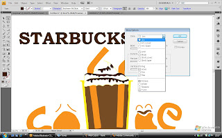 STEP 10:
then i made the word arc by choosing the 'make envelope' option and i selected 'arc' as the style.
AND FINALLY..... AFTER 10 STEPS....
.jpg)
HERE'S MY RE-DESIGNED LOGO STARBUCKS!!! TADA!!!!

No comments:
Post a Comment